Odisha Channel Bureau
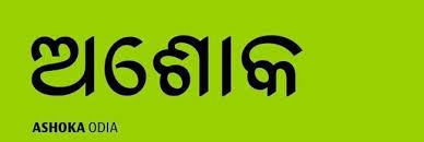
BHUBANESWAR: New Odia typeface Ashoka Odia designed by Odisha-born National Institute of Design (NID)-graduate Pratyush Das has been released by Ahmedabad-based Indian Type Foundry (ITF).
Ashoka Odia is ITF’s very first commercial typeface for the Odia script.
Ashoka Odia has been created for use in long passages of text intended for immersive reading. As a design, it is truly a series of firsts: not only is it the first text typeface designed for Odia that applies Latin-style stroke contrast to the script’s letterforms, but it is also the first Odia-script font family that takes advantage of industry standards, including multiple related weights and kerning, according to ITF.
“Ashoka Odia is also the first published typeface designed by NID-graduate Pratyush Das, and it is ITF’s first commercial release for the Odia script, too,” said ITF while releasing the new font on Monday.
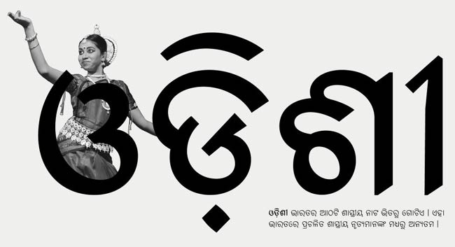
The family includes five fonts that range in weight from Thin through to Bold. The characters feature a mild degree of visible stroke contrast; the amount of contrast remains relatively similar as you move up the scale from lighter to heavier weights.
The fonts’ character sets include 270 devoted Odia-script glyphs. Thanks to the fonts’ OpenType features, these can combine into representations of all of the sounds required by the Odia language.
The Ashoka Odia character set is rounded out by a series of Latin-script numerals and basic Latin punctuation marks. The typeface itself is named after Ashoka, the famous Indian emperor who reigned in the third century B.C.E.
Many of the Odia fonts available on the market today still rely on proprietary software solutions for typesetting. As such, they have limits regarding the number of glyphs they can contain, and they can’t easily be used by designers in apps like those from Adobe.
Ashoka Odia is an OpenType font. Built on the international Unicode standard, this eliminates the problems present in older fonts developed for various proprietary typesetting systems. Thanks to OpenType, all of the unique conjuncts necessary for a script-sensitive and typographically-sophisticated rendering of Odia can finally be included in single font files. Designers, editors, and publishers no longer have to rely on non-standard keyboard work-arounds.

Pratyush Das, who hails from Bhubaneswar, graduated from NID last year with specialisation in graphic design. He is presently based in Bengaluru.
ITF released Ashoka Odia along with two other new Kannada-script typefaces – Belur Kannada, and Sandur Kannada. While Ashoka Odia began as a classroom project at NID, Belur Kannada and Sandur Kannada are the result of a successful custom type project ITF undertook several years ago.
ITF was established in 2009 by Satya Rajpurohit and Peter Biľak to design and distribute fine-quality fonts for both Indian and the global market.
“Ashoka Odia started with a clean slate and a fresh brief was formulated keeping in mind the Odia media,” according to Pratyush Das, who finished designing Ashoka Odia recently.
“There aren’t many Odia people who study or professionally pursue alternate careers as a type designer. Very few get the opportunity to study it. And even fewer get to practice it thanks to the current state of the regional media,” he adds.
With a nascent digital presence, Odia print media still continues to grow by leaps and bounds. The project was aimed at creating a typeface which will be suitable to high volume printing, providing a hierarchy and establishing a new visual tone.

“Ashoka Odia was created for use in long passages of text intended for immersive reading. As a design, it is truly a series of firsts: not only is it the first text typeface designed for Odia that applies Latin-style stroke contrast to the script’s letterforms, but it is also the first Odia-script font family that takes advantage of industry standards, including multiple related weights and kerning.”
“The characters of Ashoka Odia feature a mild degree of visible stroke contrast; the amount of contrast remains relatively similar as you move up the scale from lighter to heavier weights. While it can be used for digital applications, but if one prints something – a collection of poems or a novel – it becomes clear that not many could match the grit of this typeface in terms of aesthetic quality and technical robustness.”
Stating that few efforts had been made in the past to make Odia language more accessible and usable by its people, Das says that Ashoka Odia is a much welcomed experiment that elevates the Odia script and Odia typography to previously unseen levels and opens newer paths forward.
“The lack of Odia content online or in print isn’t necessarily limited because everyone in Odisha is typing Odia using the Latin script and keyboard. The scarcity of technical knowhow and investments in this field is such that even established regional media agencies rely on foreign technology and services to run their show. Wikipedia, Microsoft, Facebook, Google and others, are eyeing the 50 million odd Odia people as they step online. The ‘next billion’, in their view does count the Odias in. They are shaping the way we will consume content in the coming decades after all. The question is: Is it safe to entrust private entities to research and shape our culture remotely? With wide technological and contextual gaps the government seems to have no clear plan to preserve Odia’s relevance in modern times. In the meanwhile the international folks and a handful of independent designers lead the charge,” observes the designer.


